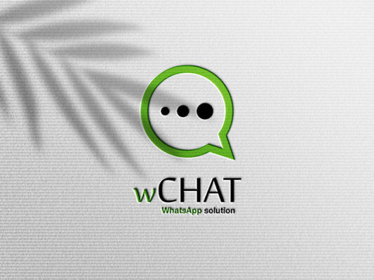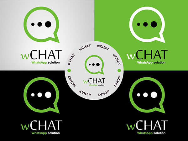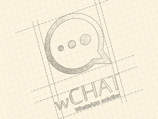
The “WCHAT” logo is designed with a modern and minimalist aesthetic, effectively utilizing color and shape to convey the brand’s identity. The primary visual element of the logo is a speech bubble, symbolizing communication and interaction, central to the WCHAT brand.
The speech bubble is filled with a bright green color, which is often associated with growth, energy, and freshness. This choice of color can signify the brand’s dynamic and vibrant nature, suggesting that WCHAT is a lively and engaging platform for communication.
Inside the speech bubble, the letters “WCHAT” are written in bold, black uppercase letters, making the text stand out prominently against the green background. The font is clean and sans-serif, which enhances readability and adds a modern touch to the design.
Below the speech bubble, the words “Live Chat” are written in a smaller, black font. This text clarifies the purpose of the platform, indicating that WCHAT is focused on real-time communication and interaction. The use of black for all the text elements ensures that they are easily readable and visually cohesive.
The overall design of the “WCHAT” logo is simple yet effective, combining a universally recognized symbol of communication with a fresh color palette. The green speech bubble draws attention and conveys energy, while the black text provides clarity and a professional appearance. Together, these elements create a logo that is both eye-catching and informative, aptly representing the brand’s core function of facilitating live chats.


