Everyone knows that advertising is visual. People are automatically drawn to things (websites, products, stores, ads…basically everything) that look nicer, calmer, more organized. But what is it that not only attracts the eye, but also conveys a certain message? Why is it that when someone sees a McDonald’s logo they get hungry?
The answer is, it’s not only the design that draws people in, but also the colors of the design which carry implicit meanings that are interpreted by our brains as feelings which can actually change our mood. Through the use of effective color marketing, companies can deliver more than just a message, they can create emotions.
This post will examine the different emotions that colors can convey, the different ways this can be used in marketing, and a few real world examples, but first, some stats:
- Color can increase brand recognition by 80% (Loyola, Maryland study)
- Up to 90% of decisions based on initial impressions are determined by color (Impact of Color on Marketing)
- Color ads are read 42% more times than the same ads in black and white (Color for Impact)
And now a little background about colors (for those of you that don’t know):
Types of colors
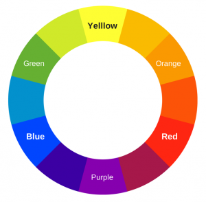
- There are three primary colors – Red, Blue, and Yellow
- There are three secondary colors – Green, Purple, and Orange, which are each made by combining two primary colors (for example: blue + yellow = green).
- There are six tertiary colors which are made by mixing a primary and a secondary color (for example: red-orange)
Harmonious color combos
- Analogous colors are any three colors that are next to each other on the color wheel. These colors are similar so they work well together.
- Complementary colors are colors that are directly across from each other on the color wheel. These colors provide a nice contrast for each other.
- Triad colors are any three colors that are equidistant from each other.
Before we continue, I would like to qualify everything that will be send in this post. At the end of the day, there is no pure science which shows that one color means one thing and a different color means something else. Colors can actually convey many different meanings depending on the context, surrounding colors, hues, and any number of other factors. When possible, I will try to show the different perspectives for each color. Now, without further ado – the colors:
RED
Red is the color of passion! Think heart, love, blood. Or you could think about it in terms of the way red is used in common speech: “red-hot,” “paint the town red,” “See red,” the list goes on. It seems that the color red is always used in very extreme idioms.
This is backed up by a bit of science as well. Seeing the color red has actually been shown to result in a rise in blood pressure and an increase in metabolism.
How to apply this
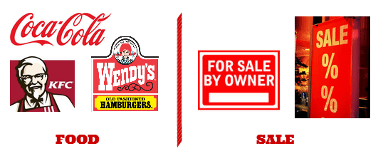
- Red creates a sense of urgency and a desire that fits well with sales and clearance ads.
- This same idea can be used to target impulse shoppers.
- Red is also good for selling food as it activates the appetite.
For example
Yellow
Yellow is a bright, vibrant color, so it comes as no surprise that it is most often associated with happiness and optimism. When you think of a smiley face what do you think of? I’m going to guess that it is probably this picture:
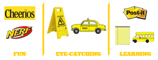
Due to the fact that it is so vibrant, yellow is also a very attention grabbing color. Think about the fact that many caution signs actually have yellow in them in order to be sure that they are noticed. Too much yellow though can be bad, as it is a harder color to process. Yellow is most efficiently used when it is combined with other colors in order to soften its effect. Despite this, yellow actually can promote motivation and creativity.
How to apply this
- Yellow is great for promoting excitement around a product.
- It can be used to create eye catching logos and advertisements.
- It is very good when used in children’s learning products.
For example
Blue
Blue is actually the world’s favorite color. Perhaps this is because blue is associated with calm and gentle aspects of nature – the sky and the ocean. For this reason, blue conveys a sense a serenity and peace. Picture yourself on a beach vacation, how would you judge the quality of the day? Obviously by the blueness of the sky and of the sea.
Due to the fact that it is such a gentle color, blue is conducive to productivity. It is also a color strongly related to trust and security. We (like most other people) really like the color blue! That’s why we chose it for our logo. We like that it is a gentle, well liked color, and feel that it helps to promote trust in our brand.
How to apply this
- Its calming effect can be used by companies looking to promote a relaxing product or environment.
- Blue is a good color to be used by larger businesses like banks in order to promote trust.
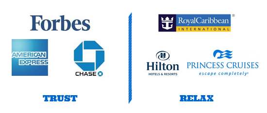
For example
Green
Green actually has a few associations. On the one hand it is associated with the environment, and, through association, health and peace. On the other hand it is associated with money (power). Interestingly, green is also the easiest color for our eyes to take in, making it a very relaxing color.
How to apply this
- Create a relaxing environment.
- Relate your ad, logo, or product to the environment.
- Convey a message of power.
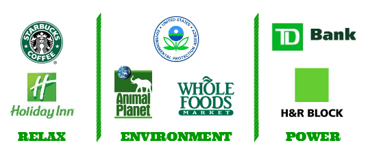
For example
Purple
Historically, purple is the color of royalty. It is a regal color. A rich purple can be associated with luxury to a certain extent (like wine). Despite that, now-a-days, purple is most frequently associated with gentleness. Although there is also a strong association between purple and the super natural.
How to apply this
- To promote beauty products.
- Darker purple can promote an environment of luxury.
- Purples are good when used for children’s products.
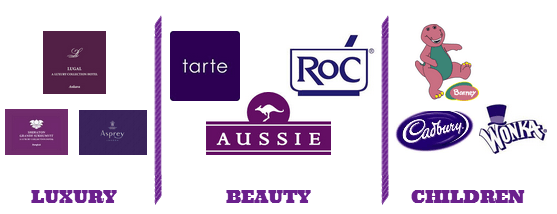
For example
Orange
Orange is a warm and exciting color. Think about the sun, fire, or, just think about a field of oranges. Orange, like red, also drives impulse actions. Despite these associations, oddly enough, orange is one of the world’s most disliked colors.
How to apply this:
- Orange is great for call-to-actions.
- It can be used as an attention grabber.
- Being a warm color, it can be used a brand logo representing a company that is young, exciting, and welcoming.
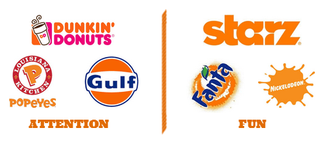
For example
Black
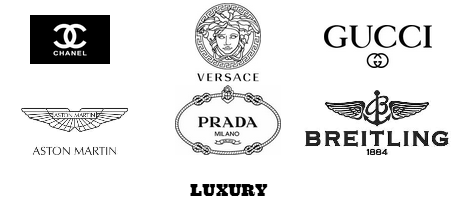
Black is the plainest color, but it packs a punch when used well. Black is most frequently associated with stability, strength, and power. For this reason it is often used as the color of luxury.
How to apply this:
- Black can be used as a contrast color with other bright colors.
- It can be used for luxury products.
For example
Brown
Too most people brown is reminiscent of the outdoors. Camping out in the forest, wood, dirt, earth. It is therefore often seen as a rugged color.
How to apply this:
- Brown is great for marketing outdoors/camping gear.
- It can add a simplistic or durable connotation to a company.
- It can be used to add a rugged edge to products in order to appeal to a specific demographic.
For example
Start Coloring
Now that you have a basic idea of how color can be used in marketing, it’s time to start applying it. Think about whether or not your brand’s logo fits in with the overarching message of your brand. Check if the color in your advertisements convey the appropriate meaning.
Authored by:
