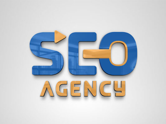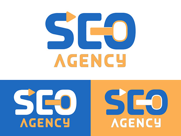
The logo for “SEO Agency” features a clean and modern design with a focus on bold typography and simple geometric elements.
Text:
– The acronym “SEO” is displayed prominently in large, uppercase letters. The font used is a modern, sans-serif typeface in blue, which conveys professionalism and reliability.
– A distinctive design element is the arrow incorporated into the letter “S,” pointing to the right. This symbolizes direction, progress, and forward movement, which are key concepts in SEO (Search Engine Optimization).
– The letter “O” is creatively designed to resemble a magnifying glass, a common symbol for search and exploration. The handle of the magnifying glass extends into the letter, and it is colored in orange, adding a visual break and emphasis within the acronym.
Subtext:
– Below “SEO,” the word “AGENCY” is written in a smaller, uppercase font. The font is the same modern, sans-serif style, but it is colored in orange to differentiate it from the main acronym. The color orange adds vibrancy and energy to the design.
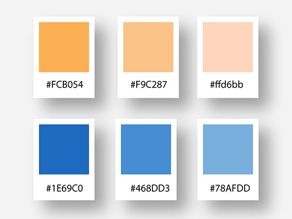
The combination of blue and orange in the logo is effective in creating a visually appealing and professional look. Blue conveys trust, dependability, and security, while orange adds a touch of creativity, enthusiasm, and attention. The overall design is sleek and modern, perfectly aligning with the brand’s focus on providing professional SEO services.


