The “Real Estate Finder” logo exhibits a clean and professional design, which is well-suited for a brand in the real estate industry. Here’s a detailed breakdown of its elements:
1. Graphic Symbol:
– Located on the left side of the logo, the symbol consists of a stylized depiction of two house roofs in gold. This imagery directly relates to real estate, making it immediately recognizable.
– Encircling the roofs is a semi-circle, rendered in a dark green color. This could symbolize a sense of completeness, unity, and trust.
2. Text:
– The brand name “Real Estate Finder” is written in a classic serif font, also in dark green, which complements the color of the semi-circle.
– The font choice adds an element of professionalism and reliability, aligning with the serious nature of real estate transactions.
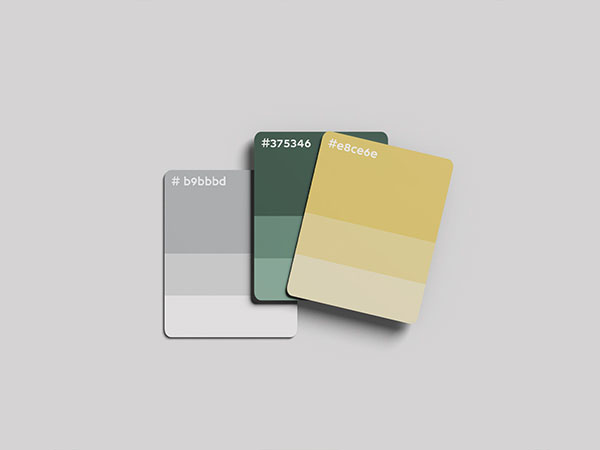
3. Color Scheme:
– The combination of gold and dark green conveys a sense of luxury, stability, and growth. Gold signifies value and prosperity, while green is often associated with growth, safety, and trust.
Overall, the “Real Estate Finder” logo effectively communicates the brand’s focus and reliability in the real estate market through its thoughtful use of symbols, colors, and typography.
