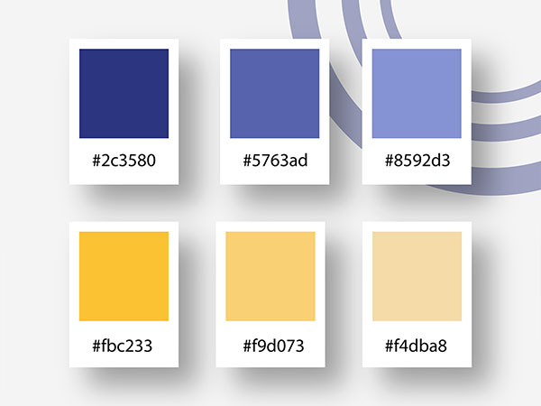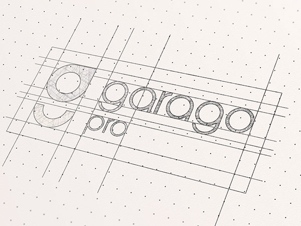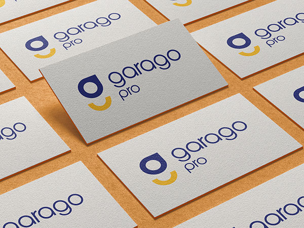
The logo features a stylized lowercase ‘g’ in dark blue, with a yellow semi-circle shape beneath it, suggesting a smiling face. Next to this graphic element is the text “garago pro,” with “garago” in a bold, sans-serif typeface and “pro” in a lighter weight and smaller size. The color scheme of dark blue and yellow creates a contrast that is both professional and approachable. The use of lowercase letters gives the logo a modern and friendly feel. The smile implied by the semi-circle adds an element of positivity to the brand identity. This combination of elements suggests that “garago pro” is likely focused on customer satisfaction and aims to present itself as an accessible yet proficient service or product provider.
