The “E Marketing Easy” logo features a distinctive and approachable design with several notable elements:
– Text and Font:
– The word “Marketing” is written in a playful, handwritten-style font in orange, making it stand out and conveying a sense of creativity and approachability.
– The word “Easy” is placed below “Marketing” in a smaller size and in a teal color, using a more casual font that complements the main text.
– Color Scheme:
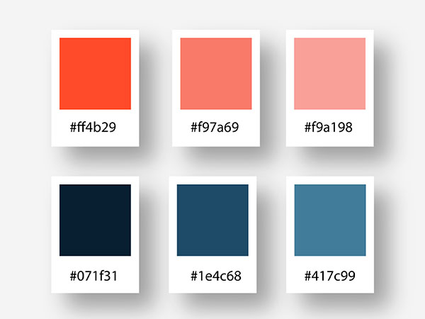
– The primary colors used are orange, teal, and shades of gray.
– The orange color in “Marketing” symbolizes energy, enthusiasm, and creativity.
– The teal color in “Easy” represents calmness, reliability, and simplicity.
– The shades of gray in the graphic element add a touch of professionalism and balance to the design.
– Design Elements:
– To the left of the text, there is a stylized graphic element composed of three rounded rectangular shapes in different shades of gray and blue. This graphic can be interpreted as an abstract representation of growth, progress, or digital elements, aligning with the theme of marketing.
– The overall design combines a sense of playfulness with professionalism, making it appealing for a service or product related to digital marketing, especially those aiming to make marketing more accessible and straightforward.
Overall, the “E Marketing Easy” logo effectively communicates a blend of creativity and ease of use, making it suitable for a brand focused on simplifying digital marketing solutions.


