-
 By
admin
By
admin - In Branding Logo & graphic design
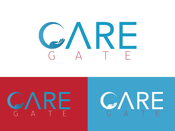
The word “GATE” is placed below “CARE” in a smaller size and in red, which adds a touch of vibrancy and urgency to the logo.
Design Elements:
The letter “C” in “CARE” is creatively designed to include a stylized hand within a semi-circle, symbolizing care, support, and protection. This visual element reinforces the caring aspect of the brand.
The letter “A” in “CARE” is uniquely represented with an open triangle, adding a modern and distinctive touch to the logo.
Overall, the “Care Gate” logo effectively combines elements of care and professionalism, making it suitable for a healthcare-related company or organization. The thoughtful use of colors and design elements ensures that the logo is both memorable and meaningful.