-
 By
By
- In Uncategorized
From collaborating with colleagues to helping with the purchase of groceries, mobile apps have been able to make app users’ lives easier. Undeniably, the apps industry is a lucrative one since the combined number of apps in Google Play and iOS app store amount to more than a million.
Have you thought why you love some of the apps more than others? …..and yes, I am not just talking about their functionality. Yes, you guessed it right! It is the experience that you get while using that app and the User Experience (UX) Design is one of the major components that distinguish successful apps from the unsuccessful ones. This is why you love apps like Flipboard, Path and Instagram.
After having first-hand experience of developing many successful apps during our journey of over 14 years, we have compiled a list of mistakes you can avoid while designing mobile apps.
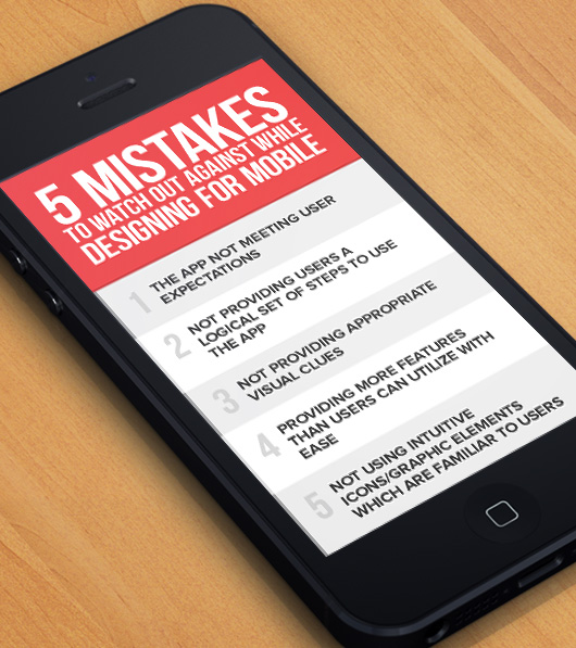
1. The app not meeting user expectations
Bringing new users ‘on board’ is perhaps not as easy as you might imagine. Different users have different sets of expectations. An app’s future can often be decided during the very first interaction with users, when they access the app after having downloaded it.
Some users might expect a tutorial to show them the various functionalities of the app and to welcome them. Others might expect the app to let them be on their own at the earliest and let them figure out things as the try out the app. It can be an onerous task to design for preferences that are clearly conflictive and many apps lose users at the very first screen because of that.
You should not have users sign in without coming to know of the value that the app has to offer them or have them fill in registration forms of considerable length. It’s not a good idea to block their way to the content they are looking for by your efforts towards branding or by animated splash screens.
To make user engagement smoother, you can get routine sign-in out of the way and provide fast log-ins through social media ids. instead.
2. Not providing users a logical set of steps to use the app
Give your users clear paths to accomplish what they want to. The number of users who abandon your app in the initial stages will come down considerably if you offer a logical set of steps for them to follow. If your users derive value from the earliest stages of using your app, the proportion of new users who become active ones will be much higher than otherwise.
3. Not providing appropriate visual clues
Often you can understand the action that you need to take to use an object even before you actually start using it. However, the visual clues upon which you base your perception of how to use an object may not always be perfect. In the case of screen-based graphical interfaces, the designers have to be even more careful about providing appropriate visual clues therefore. For mobile apps, where there usually are no pointing devices (such as a mouse), the effect is even more pronounced.
Here are a few design-related principles that you should follow:
- Go with conventional usage – You should choose allowable interactions and user interface controls that are in accordance with convention. You are quite likely to fail even if you think the new method you have implemented is better, if you don’t follow convention. That is because conventions change rather slowly as most people don’t prefer change.
- Utilize Metaphors – Metaphors are bound by cultures and regions and, so, every one may not understand these. You can ensure usability by conducting the requisite research to confirm that users understand the metaphors you use. It is, in fact, the only way to confirm that.
- Use text to explain the action required – Generally, people comprehend words faster than graphics. Having an action described in words in place of an icon is quicker for both experienced and new users to interpret. However, the scenario is different for international adoption. There it is best to use graphics along with text.
- Ensure that the conceptual model you follow is coherent – The same principles should be applicable across the interface, once a part of a gesture or the interface is learnt by the user. The issue of initial learnability remains, but coherent conceptual models still are necessary and valuable. It is through the use of metaphors, words and convention that users become familiar with your model.
You should go with functional design first and consider aesthetics later.
4. Providing more features than users can utilize with ease
First-time developers often make this mistake and tend to pack their app with too many features. However, the most successful apps are those which concentrate only on a few things and do those quite well. So, the significance of editing and re-editing your app can hardly be emphasized enough. Developers have to empathize with the needs of their target audience and, almost needless to add, have to identify the target audience properly before that.
You should focus on a few prime features, in the place of spending resources and time on developing many mediocre features.
Your app should simplify the users’ lives and let them concentrate on the few things that are really important for them. You should reduce the functionality to the tasks that are the most essential.
5. Not using intuitive icons/graphic elements which are familiar to users
The interaction standards for mobile users have not come into existence within a day or two. These have been developed over the past few years. The icons/graphic elements have been implemented in thousands of apps and been supported by extensive user testing. Some of the best interaction designers from around the world have created these icons/graphic elements. So you should not ignore these.
You may have created controls for the user interface of your app that work well in isolation in your app. However, users have to learn and remember those icons/graphic elements. That can lessen the adoption of your app by users because of the longer learning curve they have to endure. Users don’t like to have to relearn the action if it appears in another context, since your user interface control functions only within your app. It is like having users learn a new language in order to be able to communicate with your app.
Conclusion:
There are plenty of opportunities to capitalize upon in the field of mobile app development and you can benefit from them, if you keep in mind and manage to avoid a few mistakes that have been detailed above.
Have you experienced any other problems in this context? If so, please do share those with us and other readers in the comments section below.