Responsive Web Design
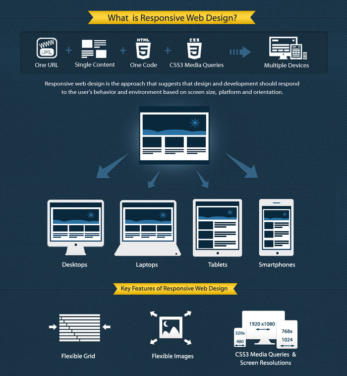
It’s the current trend in the web design world that you’ve probably heard of, yes responsive design. Responsive HTML is programming that simply responds uniquely depending on the users device, resulting in an appropriate display for the screen that they are using to view content. For us web developers, this means the painful process of hours spent designing for specific screens is potentially over. The idea is that responsive design lets webmasters create one cohesive site that works over all the current platforms, desktops, tablets, smartphones and everything in between.
A quick view and it would seem responsive HTML must be the new obvious choice for all web development, enabling you to reach every screen using one piece of code. Depending on your audience, product and site, however, it could be more sensible to tackle each screen individually.
The most important discussion taking place are based around the effect on SEO: Is responsive web design A positive or negative for SEO? There are arguments for both and it ultimately depends on you.
Responsive Web Design the details
Well written responsive design is essentially 3 key pieces of technology.
1) CSS3 Media Queries – These are the elements that identify the actual screen size and device a visitor uses to access your site. They test conditions on each device including minimum and maximum height, resolution, orientation and aspect ratio. These media queries allow you to determine which CSS style should be displayed for any given device; a critical step to achieving responsive design.
2) Fluid Grid Layout – These parts of the code are the magic that allow the page to expand or shrink dimensions so that it stays within the viewable area, without the need to scroll. Fixed-pixel sizing is rendered obsolete with this method, allowing the design to freely adjust itself by percentages and dynamically change position without breaking any other area of the site.
3) Fluid Image Scaling – Just as above, but for images. When images are sized using CSS in this fashion, the pictures work in conjunction with the fluid grid layout to achieve maximum design flexibility.
Responsive HTML Advantages
Besides the obvious flexibility, responsive design can save money by allowing developers to create one design site, rather than multiple sites and apps to cater to all manner of screens and devices. There are certainly reasons to create native apps but you need to first consider your target audience and what they are searching for. If you offer services that users need on the go – like a restaurant, shop service, salon or hotel – a responsive experience eliminates the need to download a specific mobile app, this is more likely to lead to more customers because of the ease and speed. Since mobile browsing is now the preferred platform over the desktop for searches this is a big breakthrough..
It used to be SEO experts touted the responsive method as a superior choice because of the complexity of multiple URLs, but in recent months, Google has changed the game. Up until recently, Google was not able to consolidate multiple site URLs for mobile and desktop experiences and equate it to the same business. That, however, has now changed. If you have one URL for your desktop site and another for mobile, switchboard tags now allow Google to understand which site should appear when, and your URL structure matters not. One URL may still feel like a simpler tactic for your business, but Google will find you either way.
So when is responsive design not ideal?
Last June, Google did declare that responsive HTML was their development preference, but they clearly stated they will still support dynamic serving and mobile URLs. Many wrongly assumed that because responsive is Google’s “preference,” it’s the only way to go. Google themselves still develop native apps for tablets, mobile devices and desktops, so that’s your first clue that there are still other factors to consider. It isn’t quite black and white at this point.
Speed is one of the drawbacks of responsive design right now. Because this kind of programming generally requires more code, responsive sites are often slower loading. Speed is a key SEO ranking factor, as Google gives preference to all aspects that create the best possible user experience and speed is a key factor within that. Slower load times could also negatively affect your site’s bounce rate and conversions, picked up by Google. Current research shows that mobile users aren’t the most patient and that loading times will be crucial, so it’s imperative that your responsive site still falls in reasonable load time parameters, and watch that you don’t lose customers because of speed.
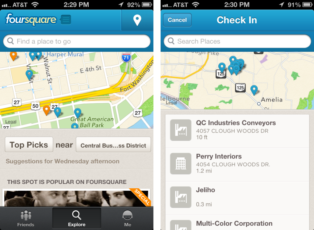
Likewise, if your audience primarily uses one screen only – maybe your site revolves almost entirely around a mobile app, like FourSquare for example – then using responsive design for multiple screens would not make much sense. Choosing the responsive route could also prove damaging to your SEO results if you only consider keywords and categories that desktop visitors will use, and not cater to mobile as well. Content is quite important when you look at responsive design from this angle. True, this is more an issue with content than the code itself, but it’s easy to leave one audience out when you’re consolidating your efforts.
What Factors Should You Consider?
One of the main factors that determine whether responsive design is right for your business predominantly falls down to your audience. If the majority of your customers are smartphone users, then they will have very specific needs that would likely only be met through a mobile-centric experience.
Alternatively, if your demographic will access your site through screens of all sizes via mobile and desktop platforms, and you are looking for a faster, easier and less expensive development process, responsive HTML would most likely be the right choice for you.
Whatever you choose, you will obviously need to give heavy consideration to the unique SEO factors inherent with each solution. Responsive HTML isn’t intrinsically good or bad for SEO, especially now that Google consolidates link equity for equivalent mobile URLs. Once again, it falls down to your customers. If you find keywords and categories are similar across screen sizes, the benefits of responsive may not be the natural choice. But if you need to consider your demo on a screen by screen basis, you may save time and money with responsive design, but the SEO and individual product losses could be catastrophic so make sure you look at it as a whole with all factors considered.
We believe the hype surrounding responsive web design is warranted. The technology makes for a better process for both developers and clients and when right for the business can save a great deal of money. As with any new technology, it’s certainly not one-size-fits-all.
By: Jonathan Mason


