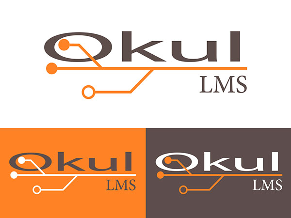
The logo for “Okul LMS” features a modern and tech-inspired design, which combines both visual and textual elements effectively. The primary component of the logo is the word “Okul,” rendered in a sleek, contemporary font in dark gray. The letters are clean and sharp, conveying a sense of professionalism and reliability.
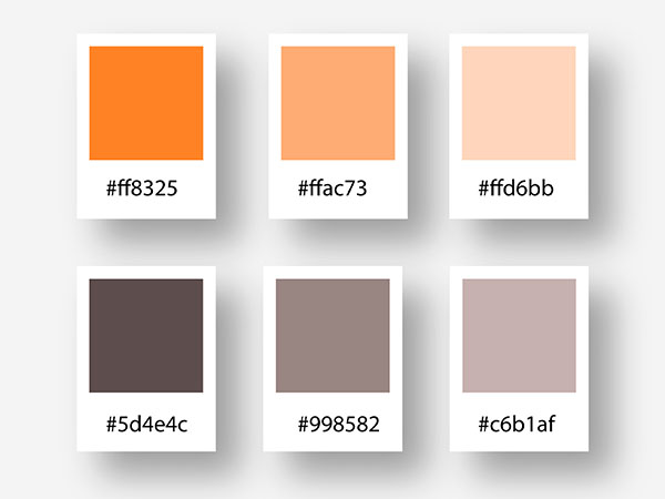
Integrated into the design is a stylized representation of a circuit, which extends from the first letter ‘O’ and runs beneath the rest of the text. This circuit graphic uses orange lines and dots, evoking the idea of connectivity and technology, which are key aspects of an LMS (Learning Management System). The orange color adds a vibrant and energetic contrast to the more subdued gray of the text, suggesting innovation and creativity.
Below the circuit graphic and the main text, the acronym “LMS” is written in a smaller, capitalized font, reinforcing the focus on the learning management system. This secondary text is also in the same dark gray color, maintaining the overall cohesive and professional appearance of the logo.
The “Okul LMS” logo, with its combination of modern typography and tech-inspired graphics, effectively communicates the brand’s focus on education and technology, making it both distinctive and relevant to its intended audience.


