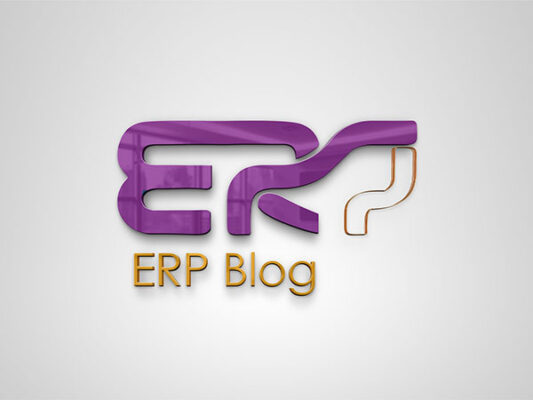
The logo for “ERP Blog” features a modern and visually engaging design with the following characteristics:
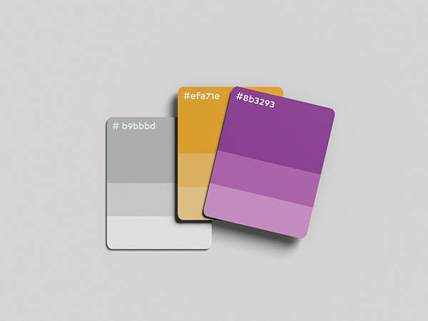
1. Color Scheme: The logo uses a combination of purple and orange. The purple color gives a sense of creativity and innovation, while the orange adds a touch of energy and enthusiasm.
2. Typography: The logo has two distinct parts:
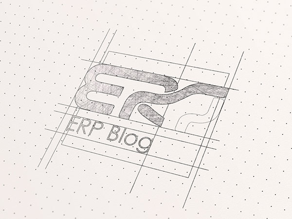
– The large, bold “ERP” letters are stylized with smooth, rounded edges and connected lines, creating a fluid and dynamic appearance.
– The “ERP Blog” text is written in a clean, sans-serif font in orange, providing a contrast to the purple “ERP” and making it easy to read.
3. Icon: The design of the “ERP” incorporates an abstract, flowing line that seems to suggest movement or a path, possibly representing the interconnected and dynamic nature of ERP systems.
4. Layout: The overall layout is compact and balanced, with the bold “ERP” dominating the top part of the logo and the “ERP Blog” text neatly positioned below it. This arrangement ensures that the logo is both eye-catching and easily recognizable.
Overall, the “ERP Blog” logo is effective in conveying a sense of modernity and connectivity, making it well-suited for a blog focused on enterprise resource planning topics.


