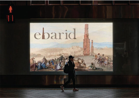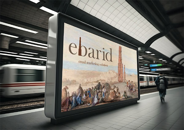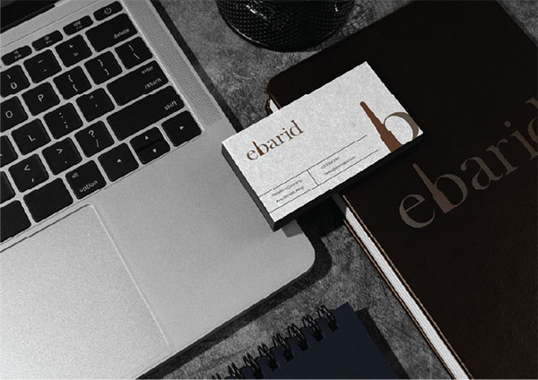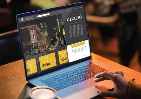
The logo for “ebarid” features a sleek and professional design with the following elements:
1. Color Scheme: The logo uses shades of brown, which convey a sense of reliability and earthiness. The primary color is a dark brown, with a lighter brown element integrated into the text.
2. Typography: The font is a serif typeface, which gives the logo a classic and sophisticated appearance. The letters are well-spaced and elegantly styled.
3. Icon: Integrated within the typography is a tall, brown tower-like structure that replaces the vertical stroke of the “b”. This unique element adds visual interest and helps to distinguish the logo.
4. Layout: The design is horizontal, making it suitable for various applications, from website headers to printed materials. The integrated icon within the text creates a cohesive and streamlined look.
Overall, the “ebarid” logo is both memorable and professional, suitable for a brand that wants to project stability and sophistication.


