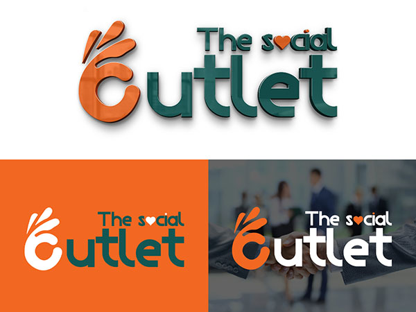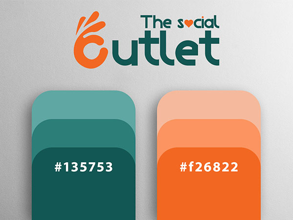
The Social Outlet logo features an abstract design element that resembles a splash or a hand with spread fingers, which is rendered in a gradient of colors transitioning from orange to green. The company name (The Social Outlet ) is written in stylized lowercase letters. The text follows the same gradient color scheme as the abstract design, creating a cohesive and modern look. The Social is smaller and positioned above Outlet, suggesting a hierarchy in the design that draws attention to the brand name. The use of vibrant colors and a dynamic abstract shape gives the logo an artistic and energetic feel, which is often associated with creativity and innovation in the marketing or digital services industry. The gradient effect adds depth and a sense of movement, implying progress and forward-thinking. Overall, it’s a contemporary design that stands out and conveys a message of a company that’s modern and engaging.


